Conscensia News
New Chapter – New Look
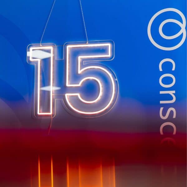
21. January 2025

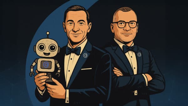
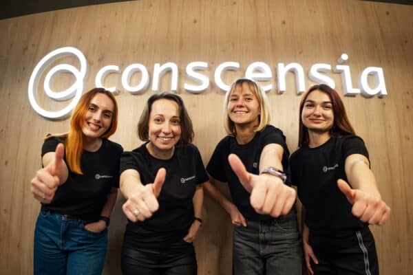
Our New Visual Identity is Here
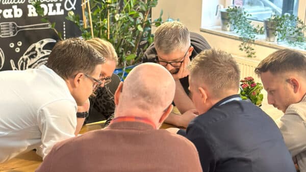
After months of hard work, creativity, and collaboration, we’re thrilled to finally reveal our rebranded visual identity! This is more than just a fresh coat of paint – it’s a bold new chapter in our story. Our new look reflects who we are, where we’re headed, and the exciting future we’re building with our customers, partners, and community.
The Change
Our visual identity is at the heart of how we communicate with the world. We want our brand to not only stand out, but to accurately represent our core.
Therefore, the new logo is not just a beautiful design – it signals a number of different important elements:
- Organic shape since we are working with people.
- Our very own infinity symbol, as we focus on long-term relationships.
- An ear signaling that we are focusing and listening to our customers.
- The C for Conscensia and Collaboration.
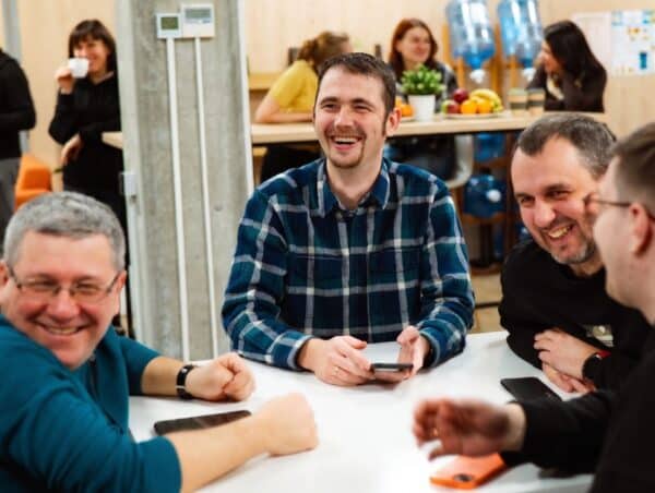
You will see a clean and fresh new look – no matter where you meet us. We have been around every corner of our organization and hubs and changed logo, colors, fonts, presentations and merchandise.
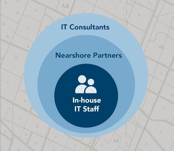
Naturally, we have also launched a brand new website, where you can find all the information you need, if you want your own nearshore team of tech specialists.
It is a new look – but our values remain the same.
Looking Ahead
Our rebranding is about more than just a new logo or colors. It represents the exciting next phase in our journey, and it’s a reflection of our ongoing commitment to build strong, dedicated tech teams through nearshoring for our customers.
We’re incredibly proud of the work that’s gone into creating this new visual identity, and we hope you like it too.
See you out there!